From React to Astro - Part II
I started revamping my old website with the intention of migrating it to Astro, keeping everything the same - content and design. That was back in the summer of 2023. But life had other plans, as it often does, and the project got parked.
Fast forward >>> to 2024, and I was determined to get it back on track. However, something had changed. The old website no longer resonated with me. I wasn’t the same web developer looking for my first job, nor did I want to showcase my bootcamp projects anymore. I craved something more personal, something that reflected my journey of learning and a place where I could share my random thoughts. So, with the new year came new aspirations and a brand-new website. First, I stripped away all the old UI styles and reorganized the content. I opted for a classic layout: header, content, footer. The website now boasts four main sections:
- Home: The gateway to my blog, where all my posts are listed.
- About: A brief introduction to who I am and what the site is all about.
- Work: A glimpse into my work experience.
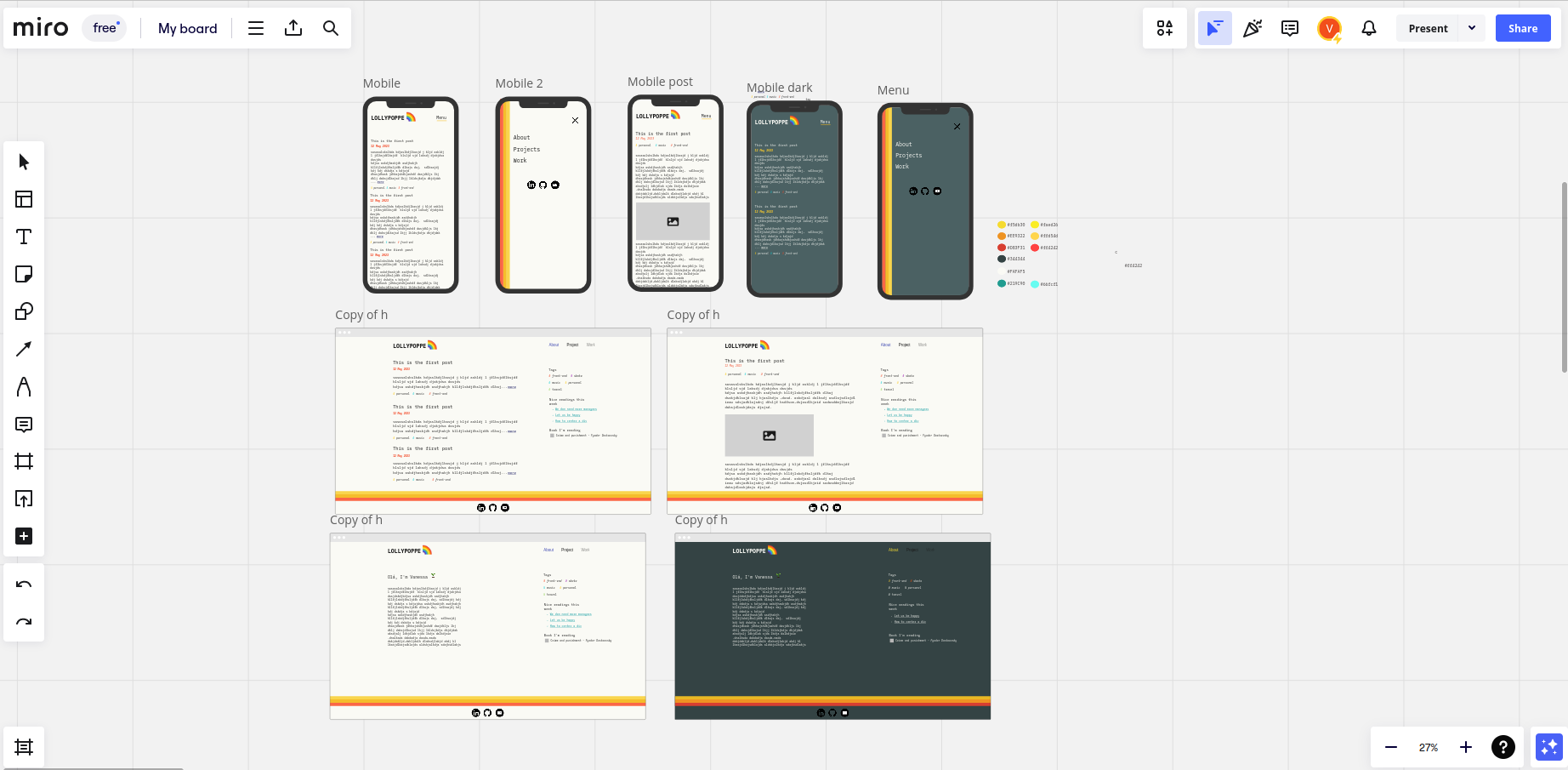
With the new structure in place, I felt the urge for a fresh design. Since this is my personal blog, I wanted something clean and easy on the eyes, with a muted color palette. This time, I decided to ditch Figma and play around in Miro. I wanted the freedom to sketch ideas quickly and experiment with colors, something between a wireframe and a prototype. As for the finer details like layout and spacing, I’ll figure those out during implementation.

I made a subtle tweak for mobile users. Instead of cluttering the screen with a side bar, I tucked it away in a interactive menu. Mobile users can access them via a handy “tags button” on the navigation bar, which pops up a full-screen modal when clicked.
And here’s the cool part: I introduced a 🌑dark / 🔆light mode . For that I just up some CSS variables for both themes and used the preferes-color-scheme query to switch between them.